Statistics and Modelling
Meenakshi Kushwaha
1st September, 2022
Packages for today
Today we will cover (a lot)
- Summary statistics
- Linear Regression models
- Handling multiple models
- Machine Learning terminology (very briefly)
Presenting Summary Statistics
Simple table in R
| year | pop | lifeExp |
|---|---|---|
| 1982 | 708000000 | 56.596 |
| 1987 | 788000000 | 58.553 |
| 1992 | 872000000 | 60.223 |
| 1997 | 959000000 | 61.765 |
| 2002 | 1034172547 | 62.879 |
| 2007 | 1110396331 | 64.698 |
Summary Statistics
Generate summary statistics by continent for gapminder dataset
| Characteristic | N = 1,7041 |
|---|---|
| continent | |
| Africa | 624 (37%) |
| Americas | 300 (18%) |
| Asia | 396 (23%) |
| Europe | 360 (21%) |
| Oceania | 24 (1.4%) |
| year | 1,980 (1,966, 1,993) |
| lifeExp | 61 (48, 71) |
| pop | 7,023,596 (2,793,664, 19,585,222) |
| gdpPercap | 3,532 (1,202, 9,325) |
| 1 n (%); Median (IQR) | |
Customizing your table
| Characteristic | N = 1,7041 |
|---|---|
| continent | |
| Africa | 624 (37%) |
| Americas | 300 (18%) |
| Asia | 396 (23%) |
| Europe | 360 (21%) |
| Oceania | 24 (1.4%) |
| lifeExp | 61 (48, 71) |
| gdpPercap | 3,532 (1,202, 9,325) |
| 1 n (%); Median (IQR) | |
Customizing your table
| Characteristic | N = 1,7041 |
|---|---|
| continent | |
| Africa | 624 (37%) |
| Americas | 300 (18%) |
| Asia | 396 (23%) |
| Europe | 360 (21%) |
| Oceania | 24 (1.4%) |
| lifeExp | 61 (48, 71) |
| pop | 7,023,596 (2,793,664, 19,585,222) |
| gdpPercap | 3,532 (1,202, 9,325) |
| 1 n (%); Median (IQR) | |
Saving your summary table
- Save as image, RTF, LaTeX, and Word file
- Embed in Rmarkdown output . . .
Save your table as .docx file
gapminder %>% select(-country, - year) %>% # drop country and year variable tbl_summary() %>% as_flex_table() %>% # save table as Word file save_as_docx(path = here("myfile.docx"))gapminder %>% select(-country, - year) %>% # drop country and year variable tbl_summary() %>% as_flex_table() %>% # save table as Word file save_as_docx(path = here("myfile.docx"))
Demo
Modelling
A simple linear model in R
What is the relationship between Life Expectancy and Population
is the same as
Linear regression in R
lm (outcome ~ exp var 1 + exp var 2 +...., data = <your_df>)
is the same as
your_df %>% lm(outcome ~ exp var 1 + exp var 2 +...., data =.)
The + here means include and not addtion
Your first linear model
Call:
lm(formula = lifeExp ~ year, data = .)

Coefficients:
(Intercept)         year
  -585.6522       0.3259
Your first linear model
Now, we will assign the model to an object to extract more information
my_model <- gapminder %>%
  lm(lifeExp ~ year, data = .)

summary(my_model)my_model <- gapminder %>%
  lm(lifeExp ~ year, data = .)

summary(my_model)
Call:
lm(formula = lifeExp ~ year, data = .)

Residuals:
    Min      1Q  Median      3Q     Max
-39.949  -9.651   1.697  10.335  22.158

Coefficients:
              Estimate Std. Error t value Pr(>|t|)
(Intercept) -585.65219   32.31396  -18.12   <2e-16 ***
year           0.32590    0.01632   19.96   <2e-16 ***
---
Signif. codes:  0 '***' 0.001 '**' 0.01 '*' 0.05 '.' 0.1 ' ' 1

Residual standard error: 11.63 on 1702 degrees of freedom
Multiple R-squared:  0.1898,    Adjusted R-squared:  0.1893
F-statistic: 398.6 on 1 and 1702 DF,  p-value: < 2.2e-16
Notice that this is the same summary function that you use with df. But depending on the input, it will give diff output.
Testing model assumptions
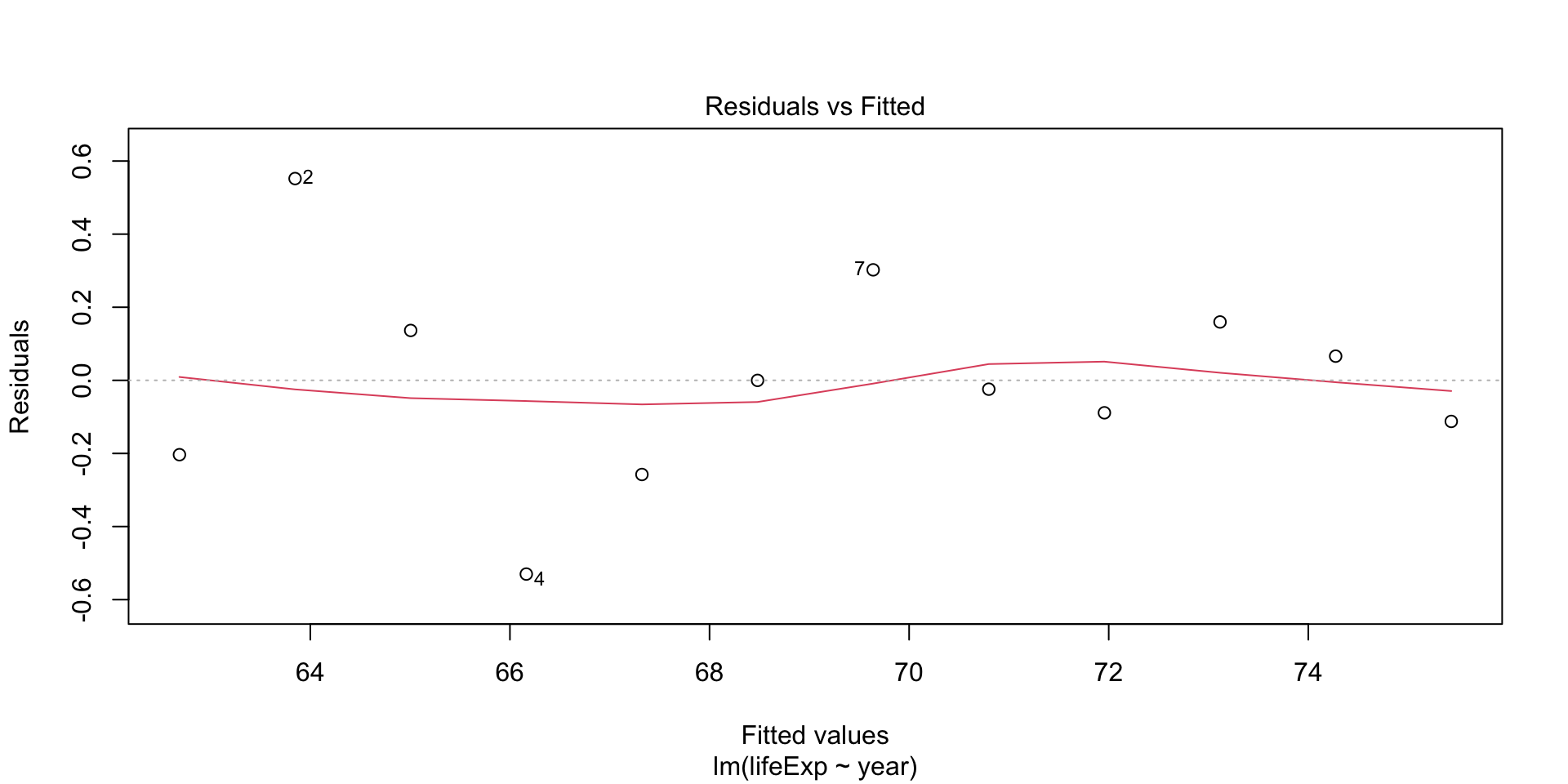
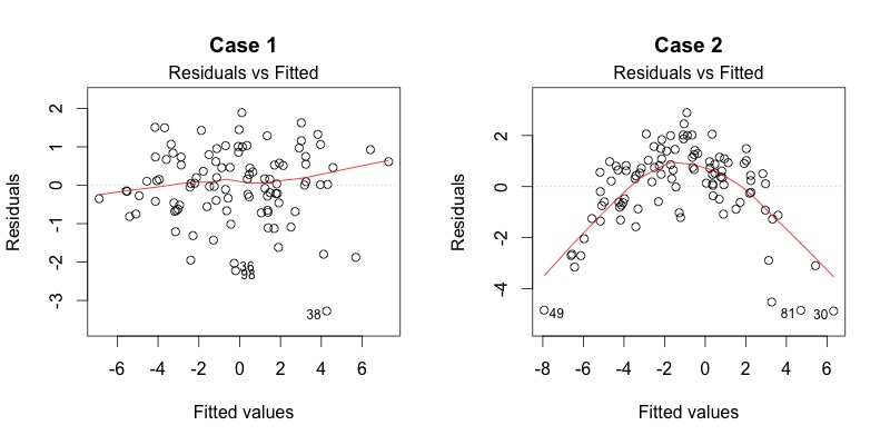
Plot diagnostics - residual vs fitted
Residuals should be equally spread around the horizontal line - any patterns indicate non-linear relationsihp
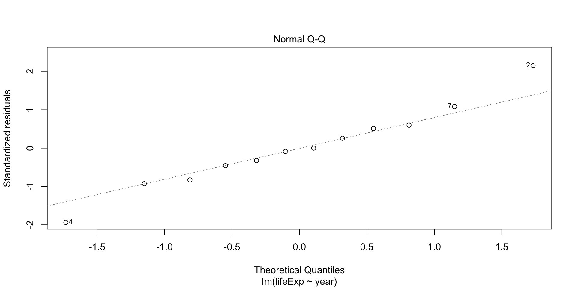
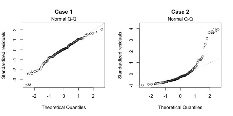
Plot diagnostics - Normal Q-Q
Residuals are normally distributed if dots fall on the straight line
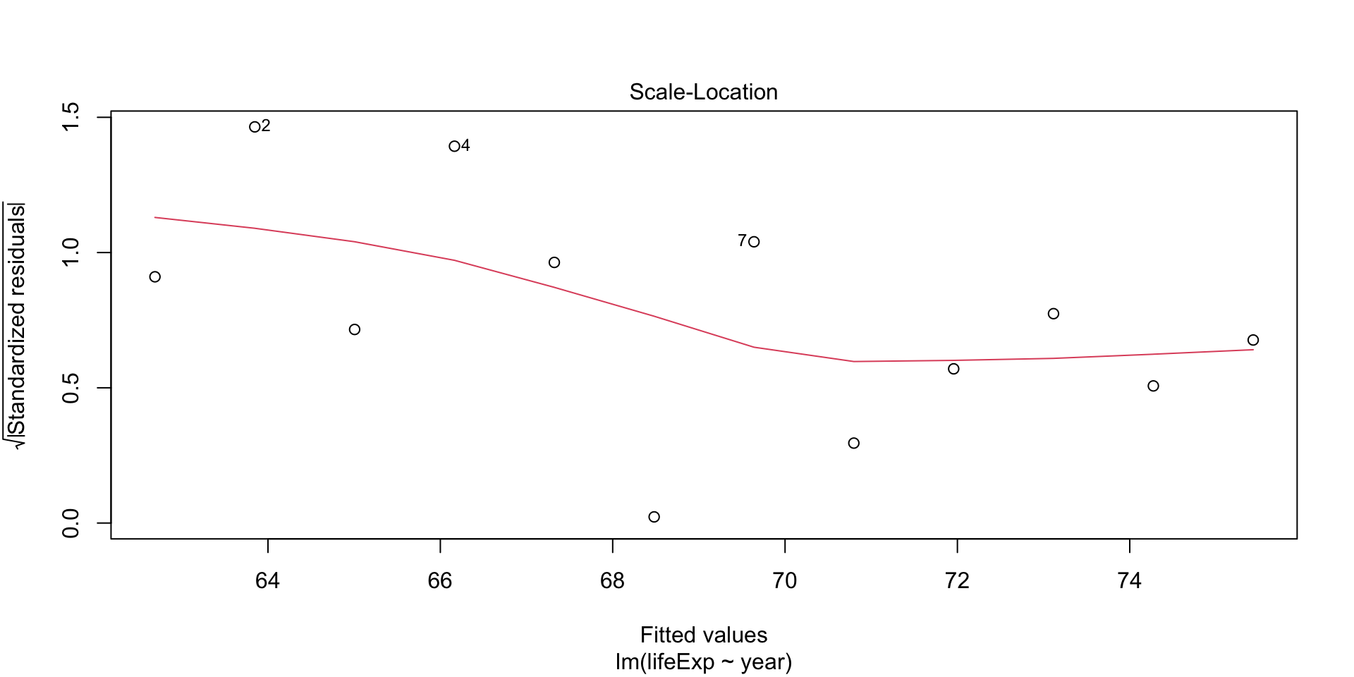
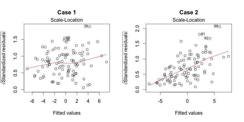
Plot diagnostics - Scale-location
This plot shows if residuals are spread equally along the range of predictors
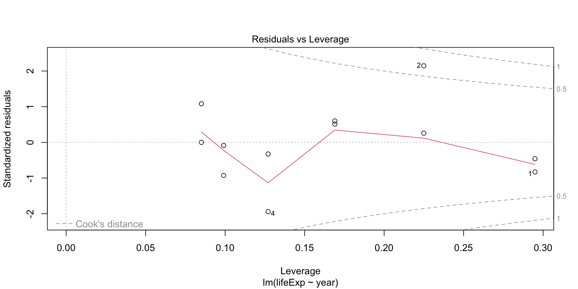
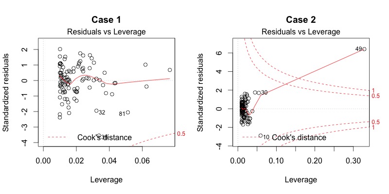
Plot diagnostics - Residuals vs Leverage
Are there influential points in the data
Demo
Multiple models
How does life expectancy change with time in each country
Global vs local trend
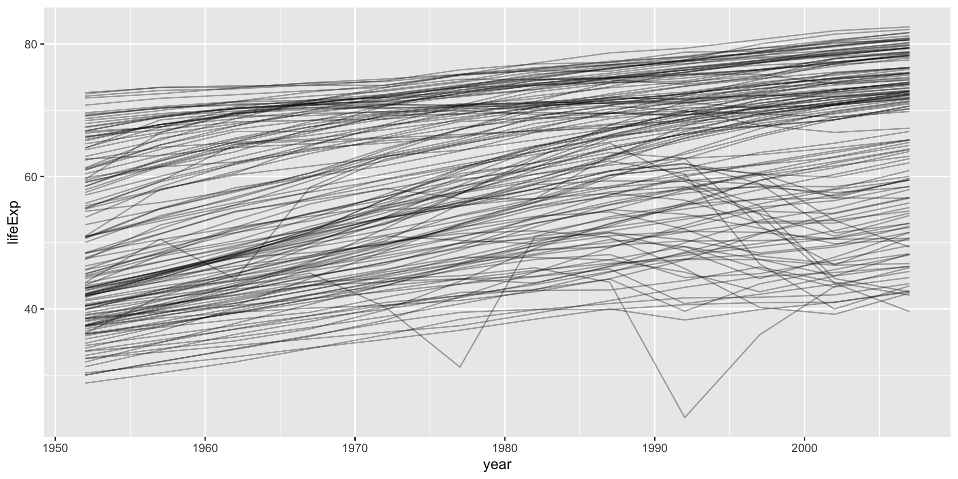
Keep related things together group_nest()
Nest by country
# A tibble: 4 × 3
  continent country                data
  <fct>     <fct>    <list<tibble[,5]>>
1 Africa    Algeria            [12 × 5]
2 Africa    Angola             [12 × 5]
3 Africa    Benin              [12 × 5]
4 Africa Botswana [12 × 5]- by default list column is named
data year1950for meaningful intercepts- add
continentto keep it along withcountry
One country example
# A tibble: 12 × 4
    year lifeExp        pop gdpPercap
   <int>   <dbl>      <int>     <dbl>
 1  1952    37.4  372000000      547.
 2  1957    40.2  409000000      590.
 3  1962    43.6  454000000      658.
 4  1967    47.2  506000000      701.
 5  1972    50.7  567000000      724.
 6  1977    54.2  634000000      813.
 7  1982    56.6  708000000      856.
 8  1987    58.6  788000000      977.
 9  1992    60.2  872000000     1164.
10  1997    61.8  959000000     1459.
11  2002    62.9 1034172547     1747.
12 2007 64.7 1110396331 2452.# A tibble: 12 × 7
continent country year lifeExp pop gdpPercap year1950
<fct> <fct> <int> <dbl> <int> <dbl> <dbl>
1 Asia India 1952 37.4 372000000 547. 2
2 Asia India 1957 40.2 409000000 590. 7
3 Asia India 1962 43.6 454000000 658. 12
4 Asia India 1967 47.2 506000000 701. 17
5 Asia India 1972 50.7 567000000 724. 22
6 Asia India 1977 54.2 634000000 813. 27
7 Asia India 1982 56.6 708000000 856. 32
8 Asia India 1987 58.6 788000000 977. 37
9 Asia India 1992 60.2 872000000 1164. 42
10 Asia India 1997 61.8 959000000 1459. 47
11 Asia India 2002 62.9 1034172547 1747. 52
12 Asia India 2007 64.7 1110396331 2452. 57Linear model per country
# A tibble: 142 × 4
   continent country                                data model
   <fct>     <fct>                    <list<tibble[,5]>> <list>
 1 Africa    Algeria                            [12 × 5] <lm>
 2 Africa    Angola                             [12 × 5] <lm>
 3 Africa    Benin                              [12 × 5] <lm>
 4 Africa    Botswana                           [12 × 5] <lm>
 5 Africa    Burkina Faso                       [12 × 5] <lm>
 6 Africa    Burundi                            [12 × 5] <lm>
 7 Africa    Cameroon                           [12 × 5] <lm>
 8 Africa    Central African Republic           [12 × 5] <lm>
 9 Africa    Chad                               [12 × 5] <lm>
10 Africa    Comoros                            [12 × 5] <lm>
# … with 132 more rows
Quiz
- How would you count how many rows are there per country?
- Plot Life expectancy
LifeExpVSYearfor India
map practice
How many rows per country?
# A tibble: 4 × 2
  country      n
  <fct>    <int>
1 Algeria     12
2 Angola      12
3 Benin       12
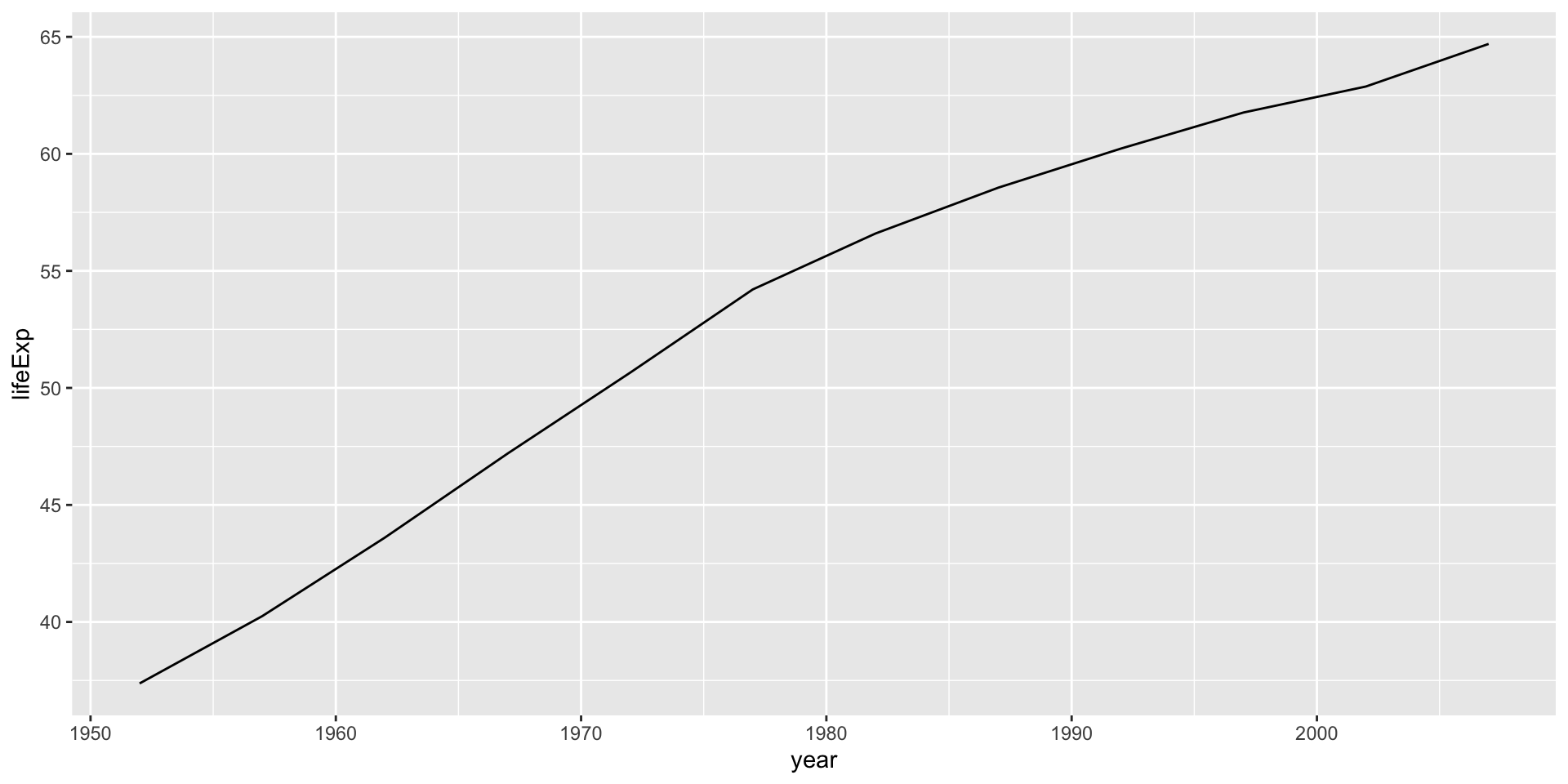
4 Botswana 12Plotting for one country
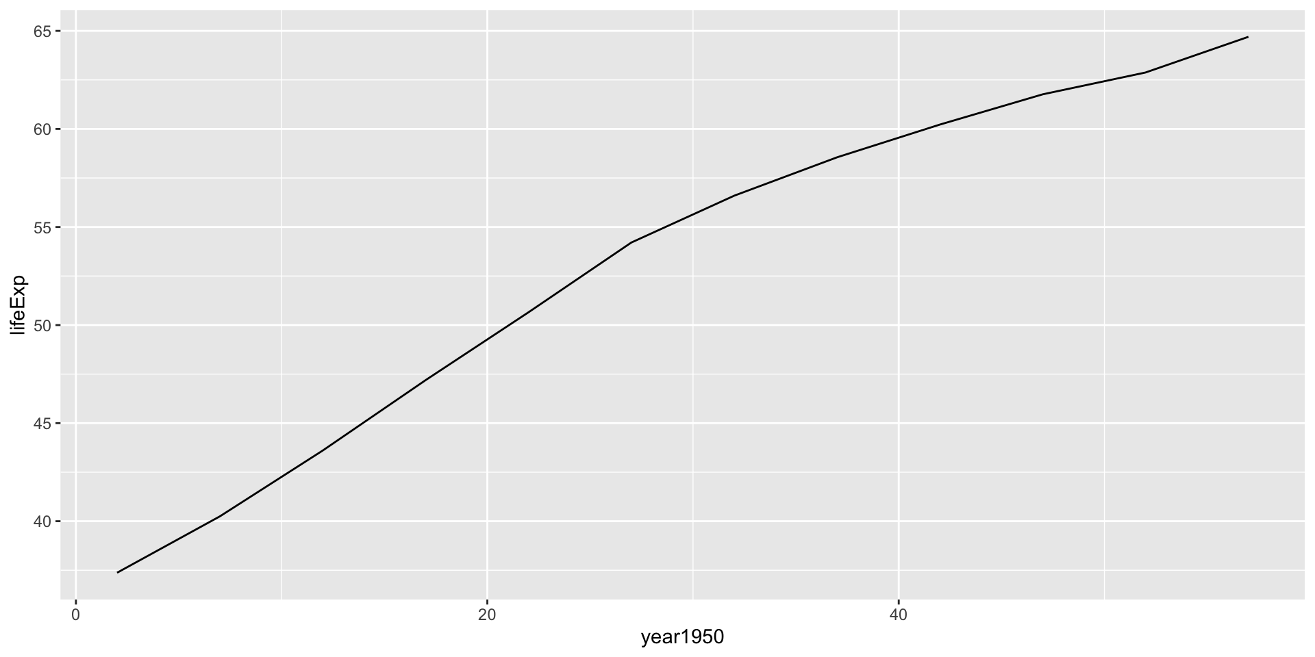
Linear model for India
Call:
lm(formula = lifeExp ~ year1950, data = .)

Residuals:
     Min       1Q   Median       3Q      Max
-2.36441 -1.57472  0.04961  1.35537  2.30522

Coefficients:
            Estimate Std. Error t value Pr(>|t|)
(Intercept) 38.25911    0.98600   38.80 3.09e-12 ***
year1950     0.50532    0.02885   17.52 7.81e-09 ***
---
Signif. codes:  0 '***' 0.001 '**' 0.01 '*' 0.05 '.' 0.1 ' ' 1

Residual standard error: 1.725 on 10 degrees of freedom
Multiple R-squared:  0.9684,    Adjusted R-squared:  0.9653
F-statistic: 306.8 on 1 and 10 DF,  p-value: 7.813e-09
Linear model for Rwanda
Call:
lm(formula = lifeExp ~ year1950, data = .)

Residuals:
    Min      1Q  Median      3Q     Max
-17.310  -1.445   2.410   3.073   6.021

Coefficients:
            Estimate Std. Error t value Pr(>|t|)
(Intercept) 42.83361    3.74890  11.426 4.63e-07 ***
year1950    -0.04583    0.10969  -0.418    0.685
---
Signif. codes:  0 '***' 0.001 '**' 0.01 '*' 0.05 '.' 0.1 ' ' 1

Residual standard error: 6.558 on 10 degrees of freedom
Multiple R-squared:  0.01716,   Adjusted R-squared:  -0.08112
F-statistic: 0.1746 on 1 and 10 DF,  p-value: 0.6849
Verify by plotting for Rwanda
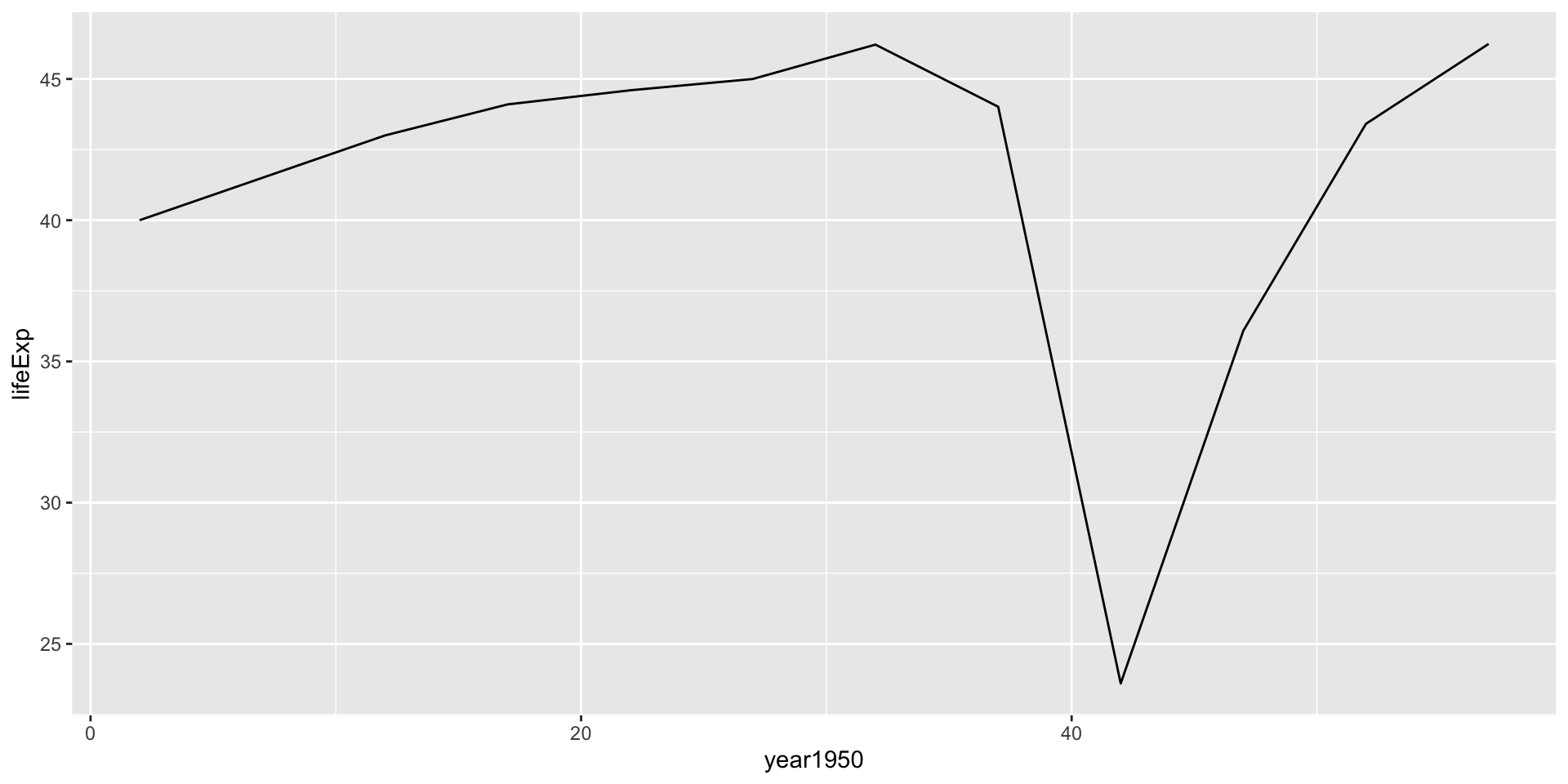
Cleaning model outputs using broom package

tidy()summarizes information about model componentsglance()reports information about the entire modelaugment()adds informations about observations to a dataset
How doesbroom clean up model outputs
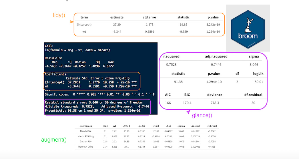
Tyding models
Extract from nested lists
# A tibble: 142 × 8
   continent country                data model glance   tidy     augment     rsq
   <fct>     <fct>              <list<t> <lis> <list>   <list>   <list>    <dbl>
 1 Africa    Algeria            [12 × 5] <lm>  <tibble> <tibble> <tibble> 0.985
 2 Africa    Angola             [12 × 5] <lm>  <tibble> <tibble> <tibble> 0.888
 3 Africa    Benin              [12 × 5] <lm>  <tibble> <tibble> <tibble> 0.967
 4 Africa    Botswana           [12 × 5] <lm>  <tibble> <tibble> <tibble> 0.0340
 5 Africa    Burkina Faso       [12 × 5] <lm>  <tibble> <tibble> <tibble> 0.919
 6 Africa    Burundi            [12 × 5] <lm>  <tibble> <tibble> <tibble> 0.766
 7 Africa    Cameroon           [12 × 5] <lm>  <tibble> <tibble> <tibble> 0.680
 8 Africa    Central African R… [12 × 5] <lm>  <tibble> <tibble> <tibble> 0.493
 9 Africa    Chad               [12 × 5] <lm>  <tibble> <tibble> <tibble> 0.872
10 Africa    Comoros            [12 × 5] <lm>  <tibble> <tibble> <tibble> 0.997
# … with 132 more rows
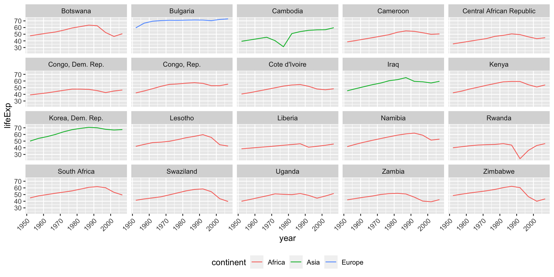
Do linear models fit all countries?
Do linear models fit all countries?

Countries with non-linear trends
Focus on countries with low rsq
Countries with non-linear trends
Countries with strong linear trends
Focus on countries with high rsq
Countries with strong linear trends

Interpreting the linear model
India, lifeExp~year1950

Interpreting the linear model
India, lifeExp~year

Visualizing all models
gm_models %>%
  unnest(tidy) %>%
  select(continent, country, rsq, term, estimate) %>%
  pivot_wider(names_from = term, values_from = estimate) %>%
  ggplot(aes(x = `(Intercept)`, y = year1950)) +
  geom_point(aes(colour = continent, size = rsq)) +
  geom_smooth(se = FALSE, method = "loess") +
  scale_size_area() + labs(x = "Life expectancy (1950)", y = "Yearly improvement")
Visualizing all models
Where does Linear regression fit in Machine Learning?
ML Cheatsheet
Resources
-Tutorial by A. Ginolhac
-R for Data Science Book - Modelling chapters
